/////////////////////////////////// Updated on June 28, 2020 ////////////////////////////////////
Since our client did not ultimately implement and produce Kwell Candy, we were concerned about the violation of our client's logo. Also, because we are passionate about this design, we created an iteration of the original design. Hope you guys like our update as well :)
Overview
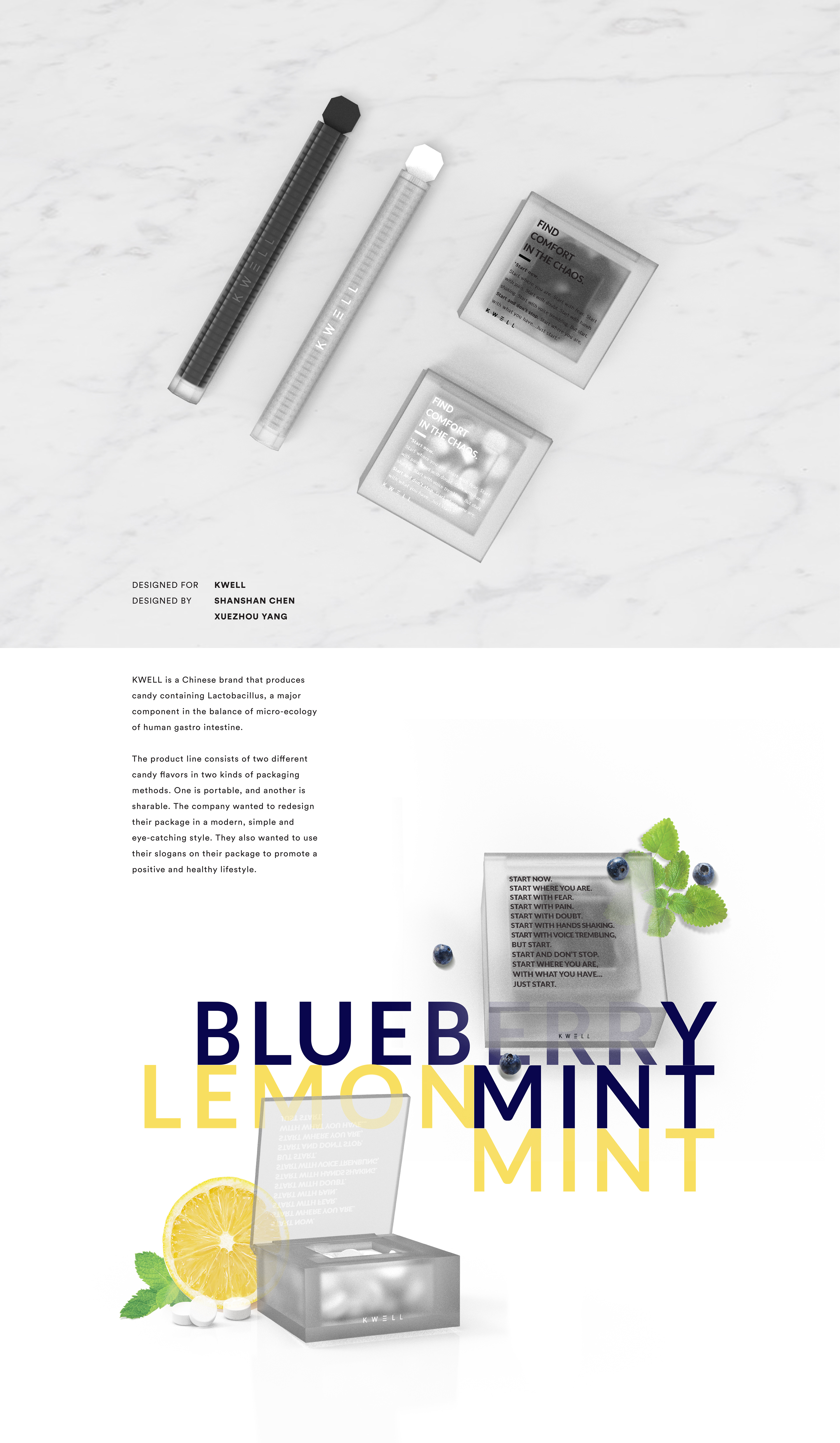
As designers, we often must cope with irregular meals and suffer from occasional digestive discomfort or upset. Therefore, we came up with an idea to develop portable, chic, and minimal packaging for our best friend (besides coffee) —digestive tablets—at work.
Naming
We hope to pull off a fun message for our bodily discomfort. By naming the product Well, K., we wish to end the conversation with our digestive upset and get back to work.
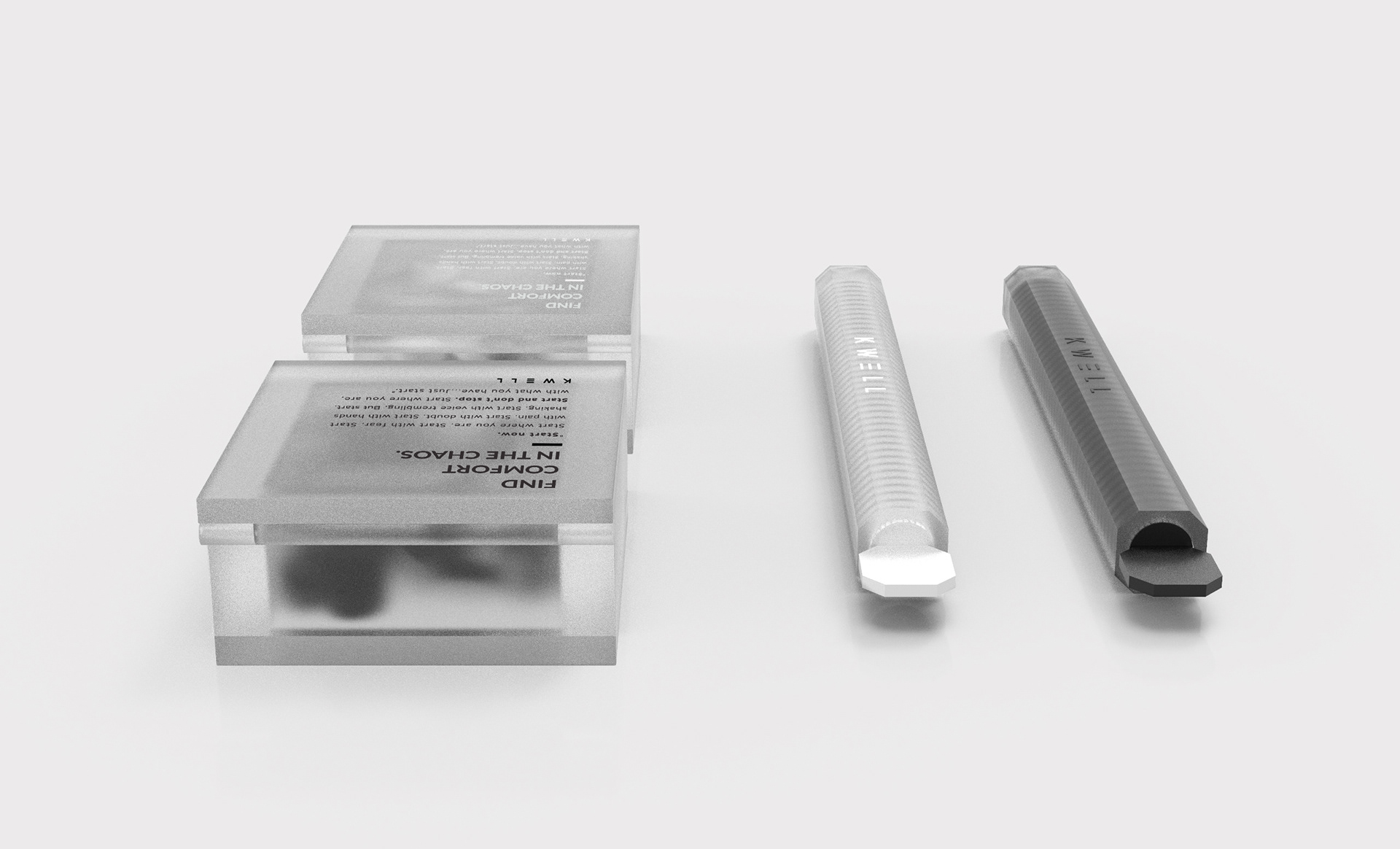
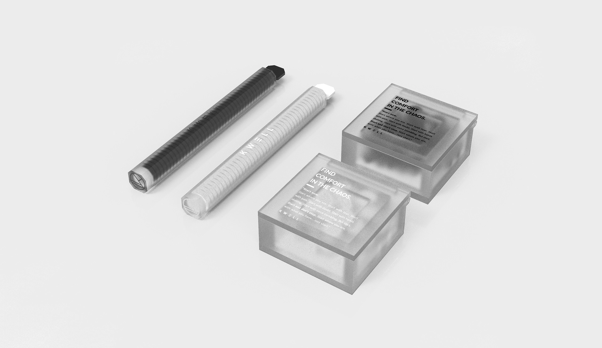
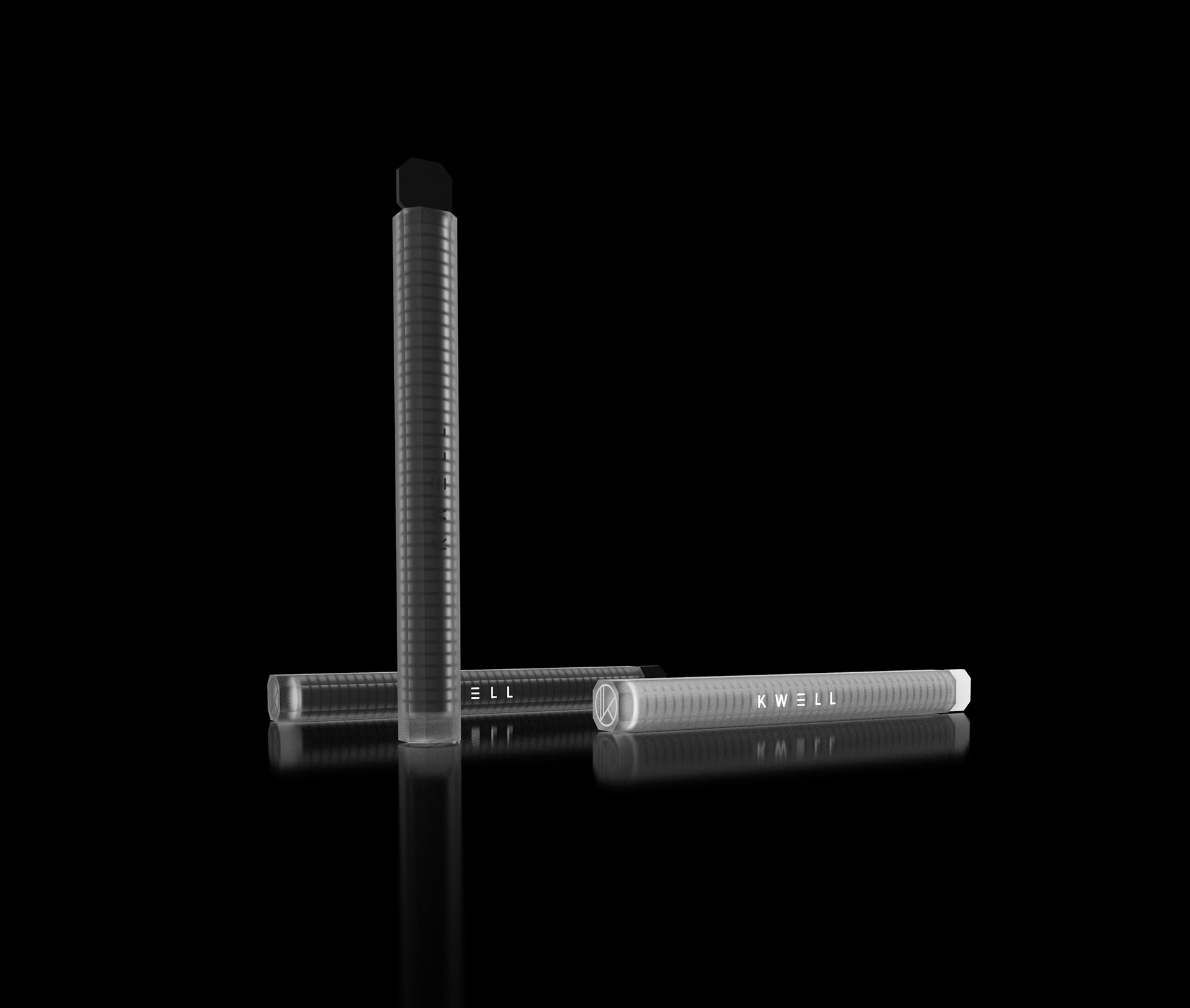
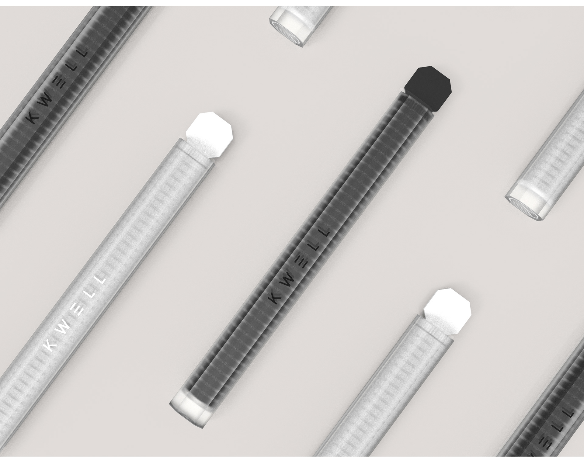
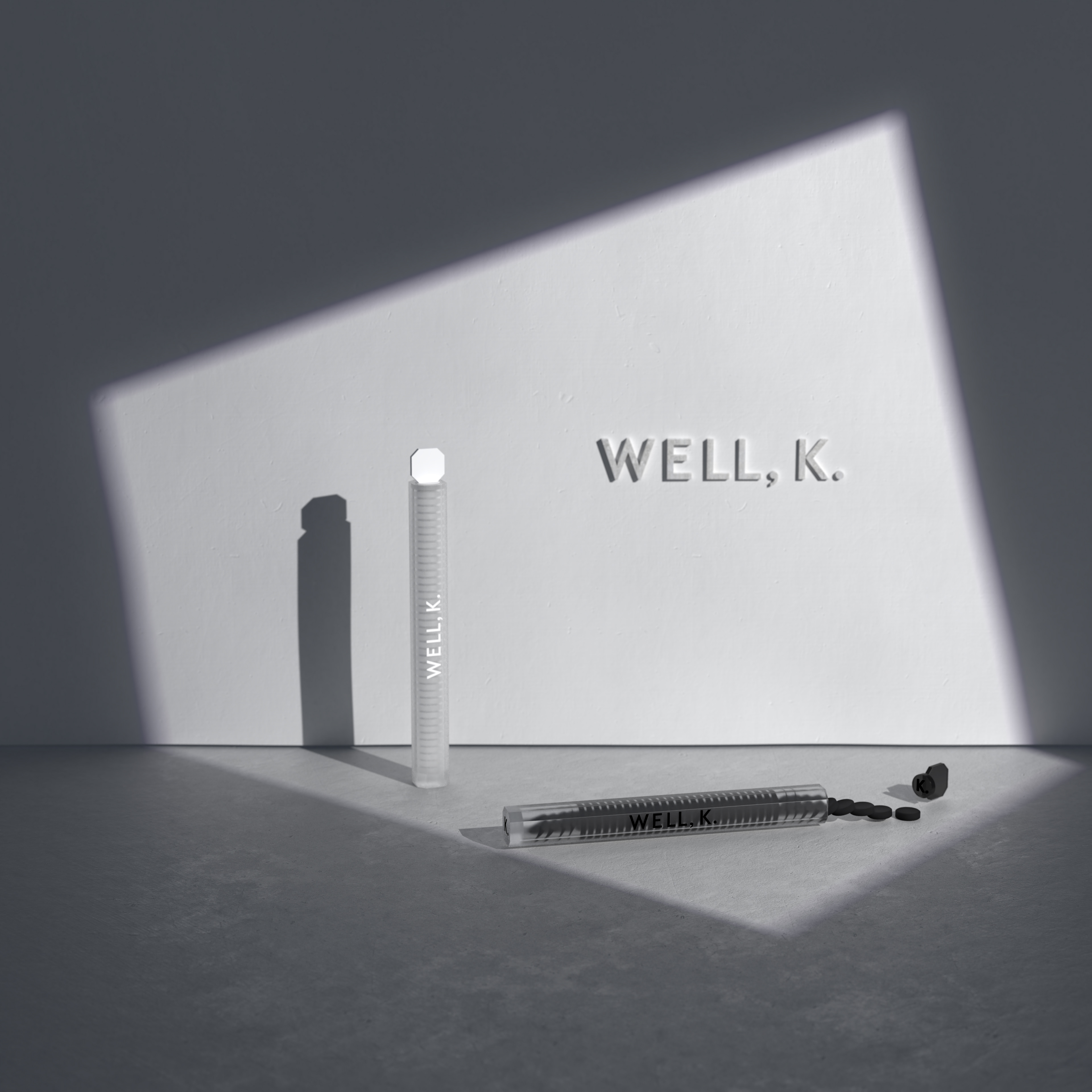
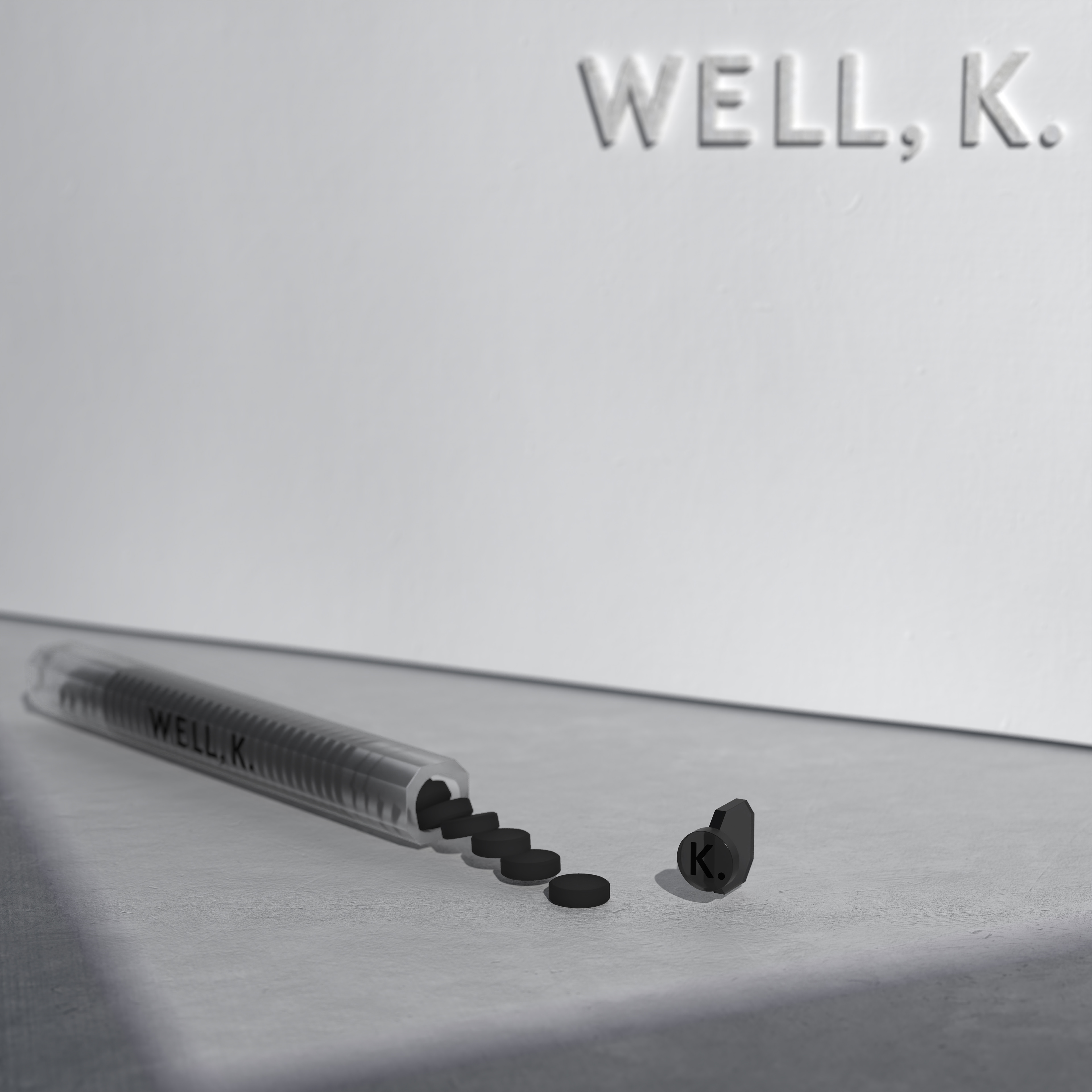
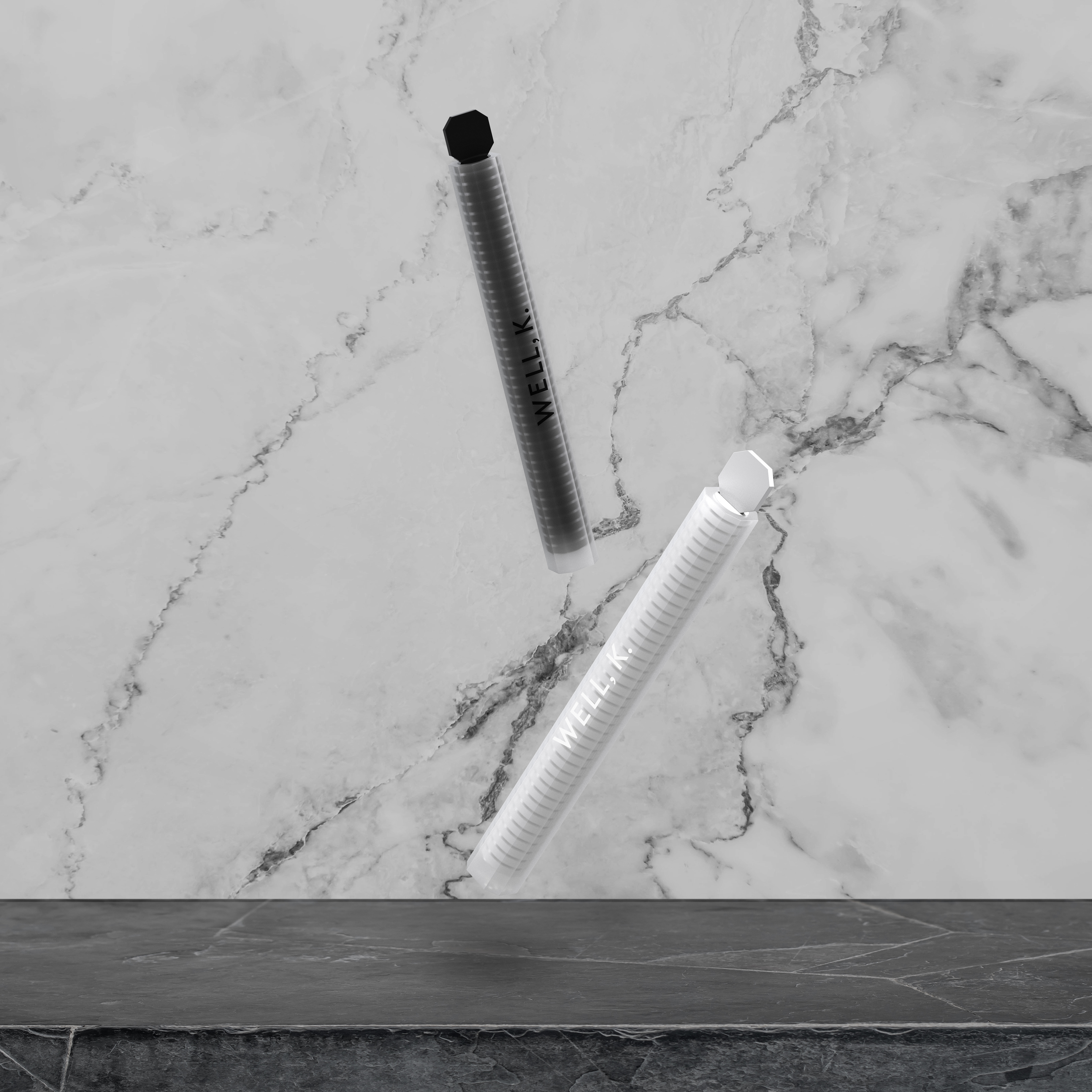
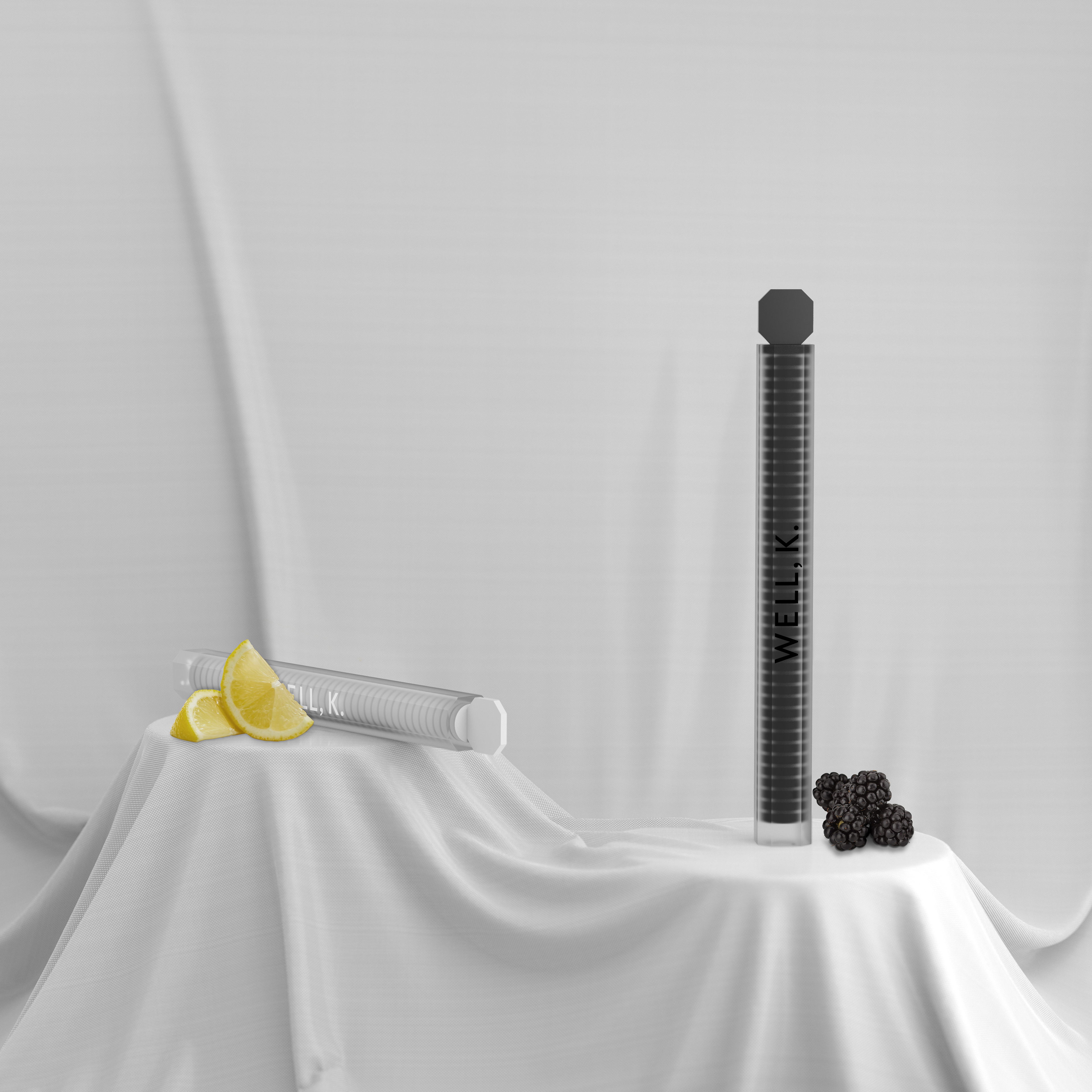
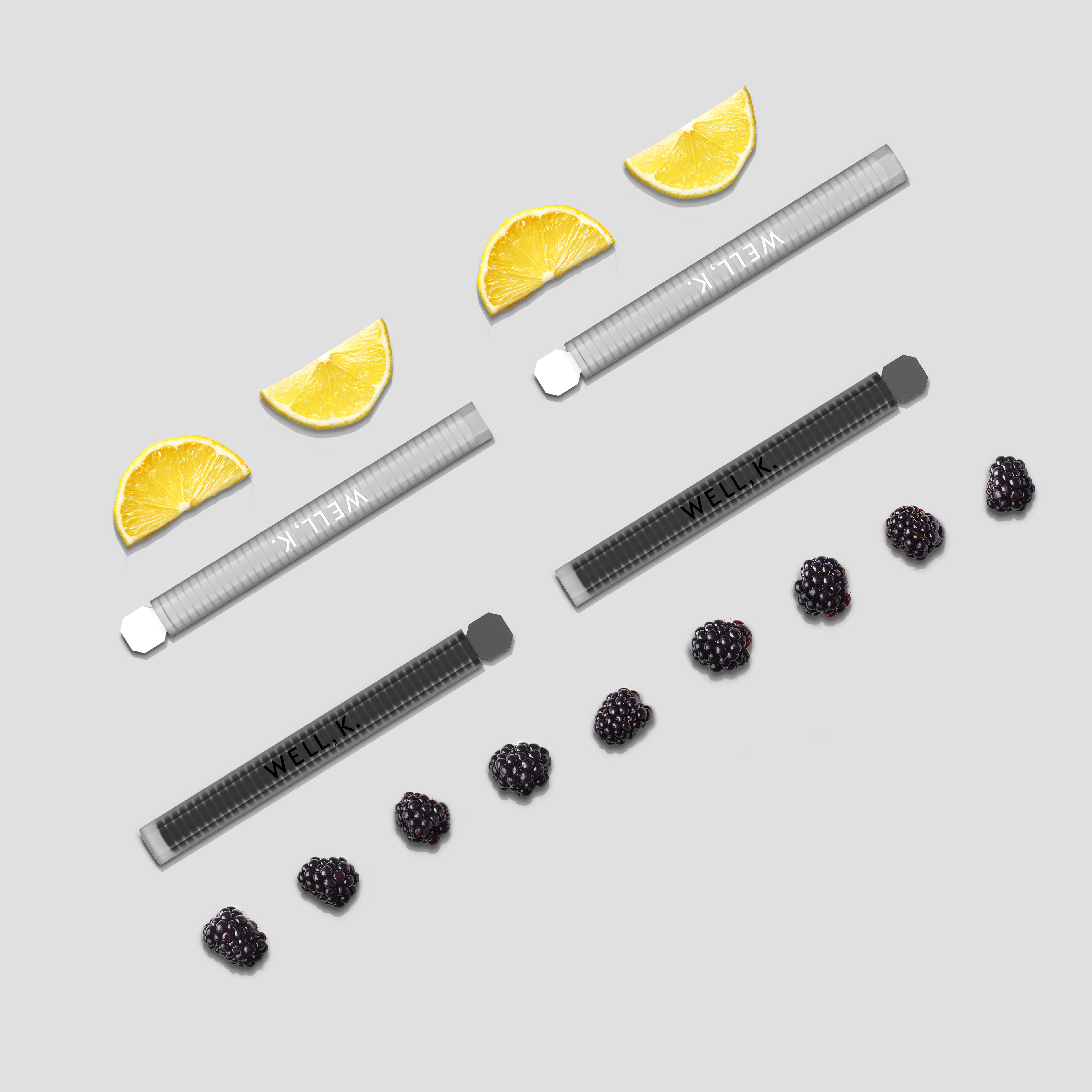
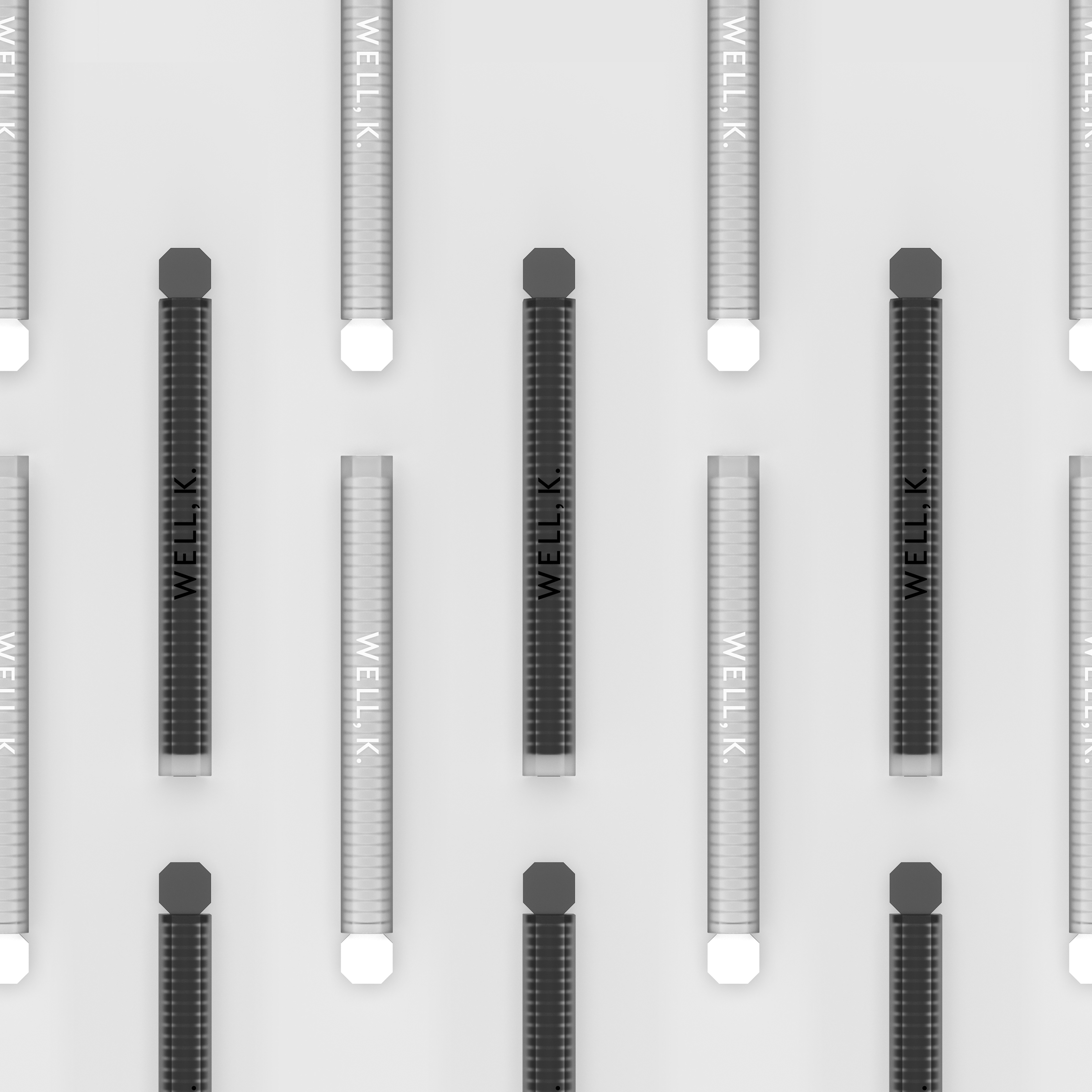
Our logo design reflects the product—clean, chic, and effective. We paired the logo with a modern sans-serif typeface and a black-and-white color scheme to match with our naturally flavored (lemon and blackberry) digestive tablets.
Packaging
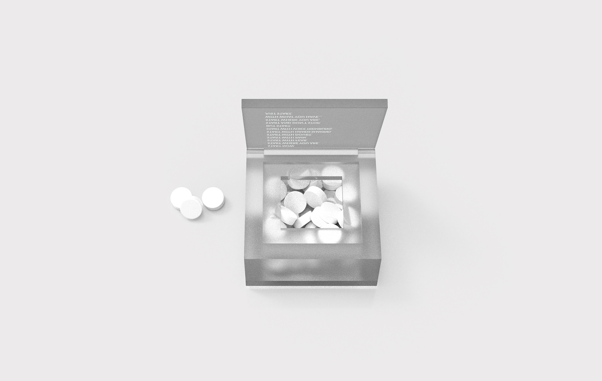
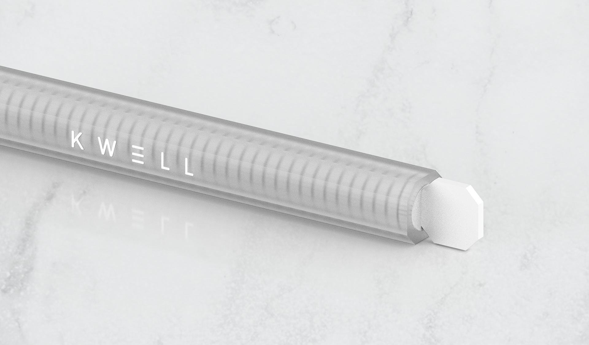
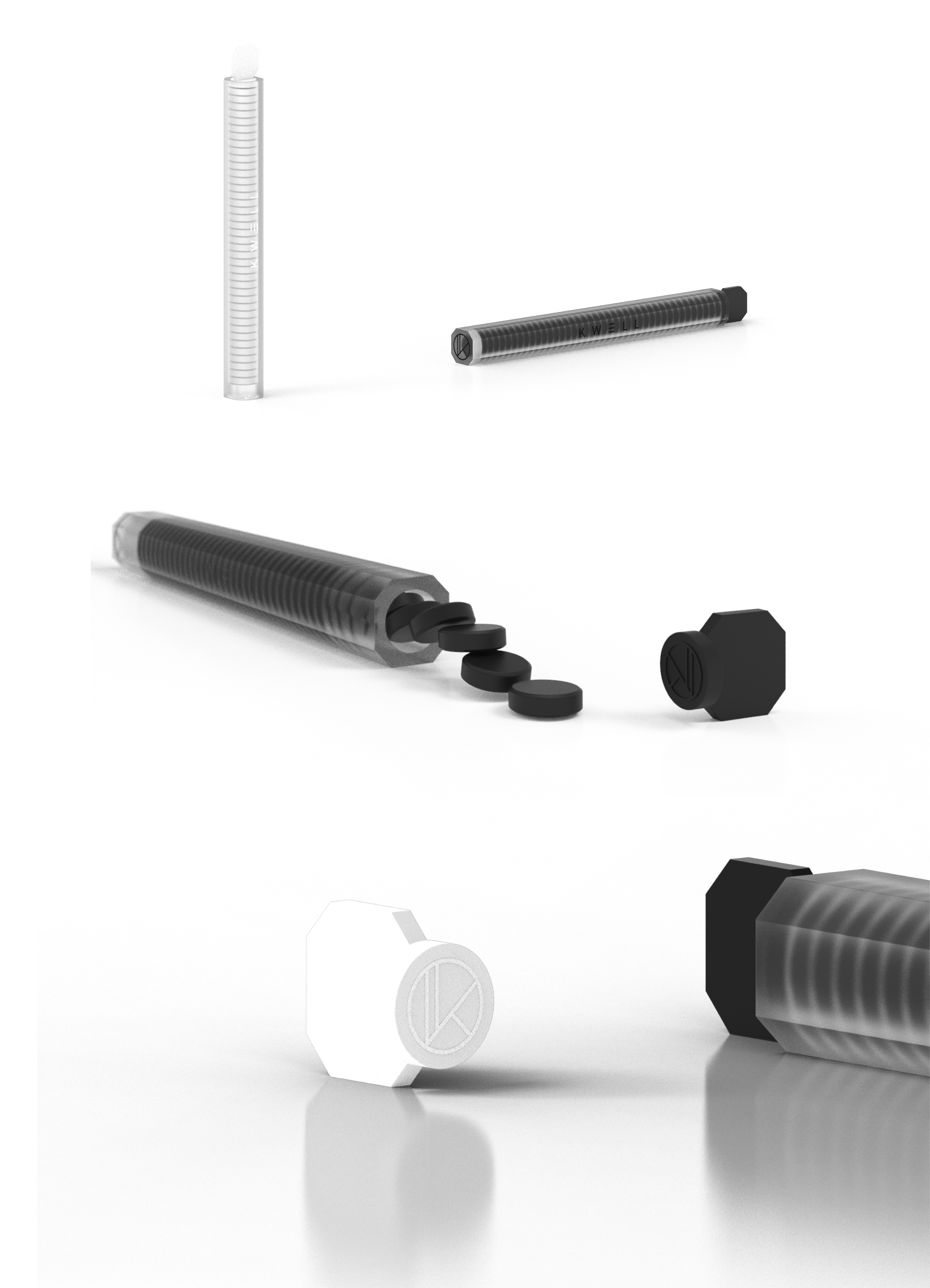
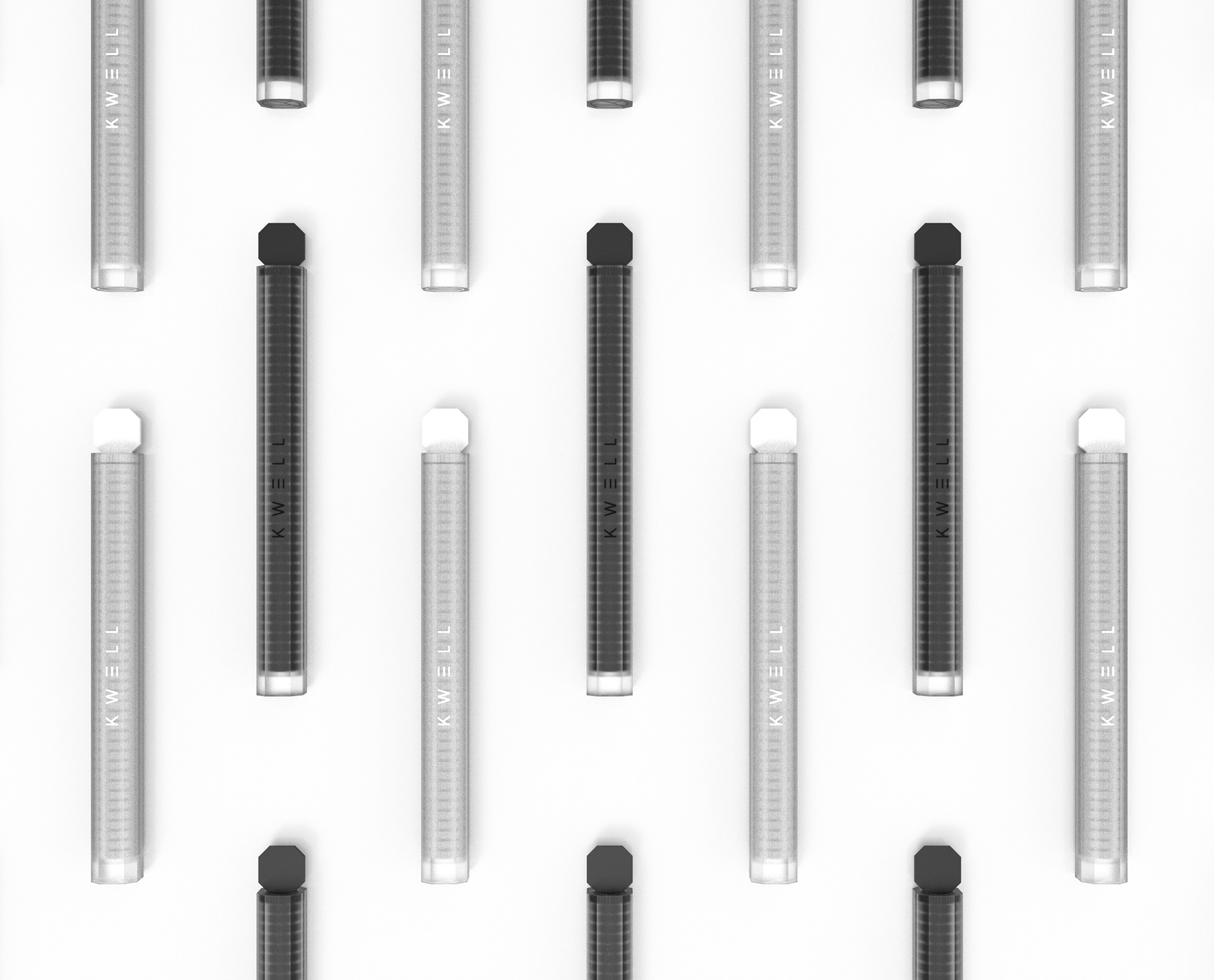
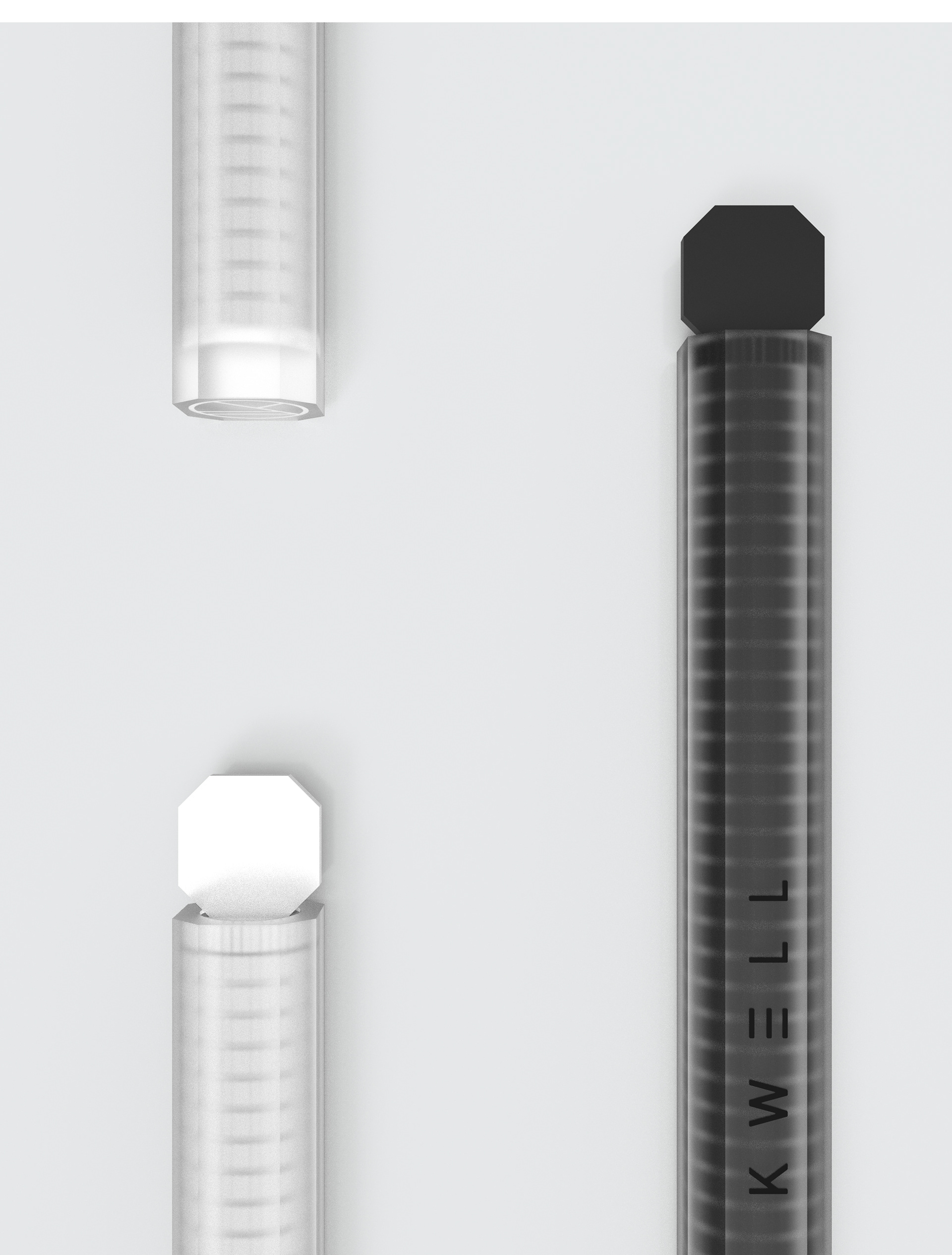
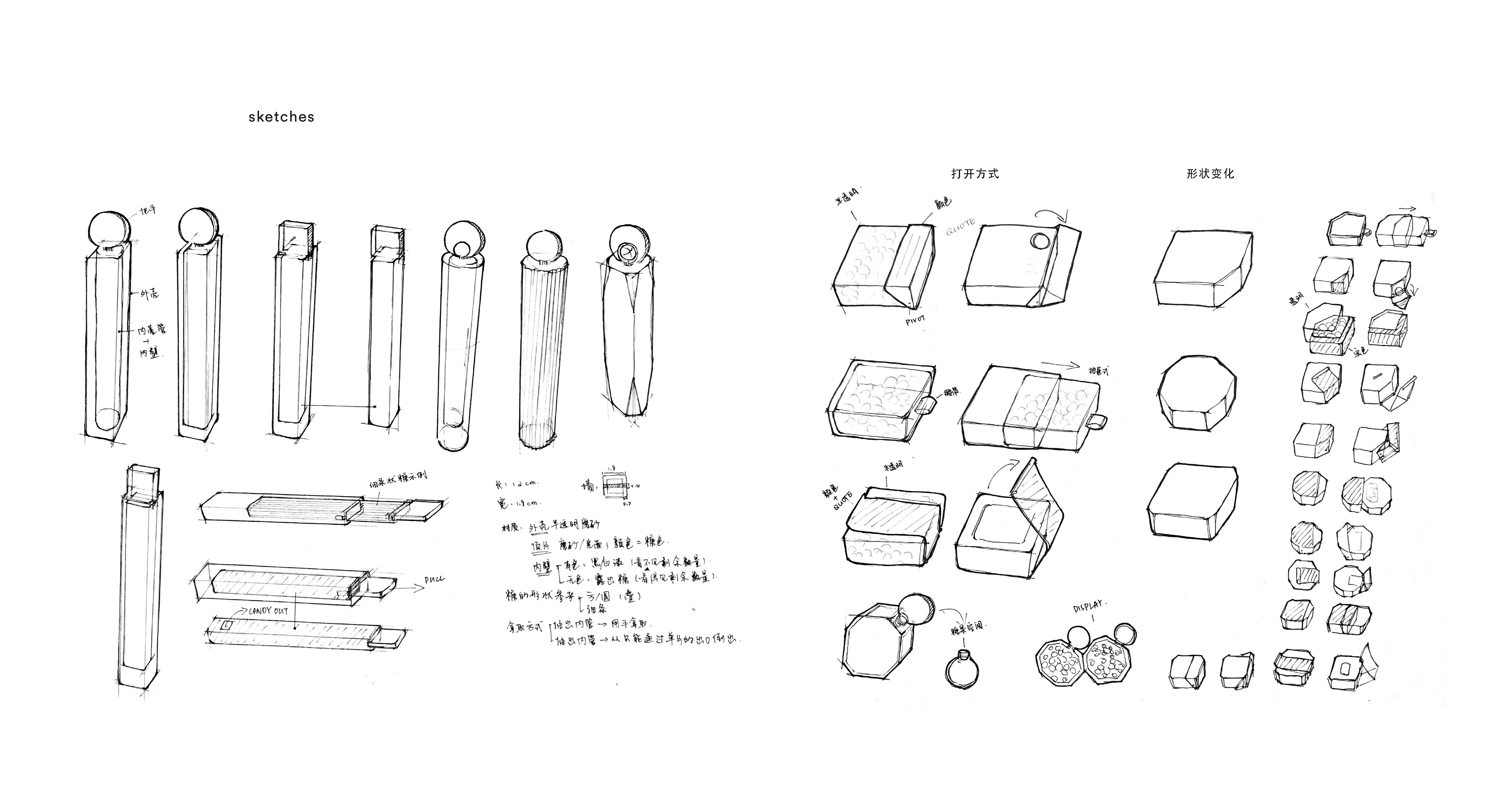
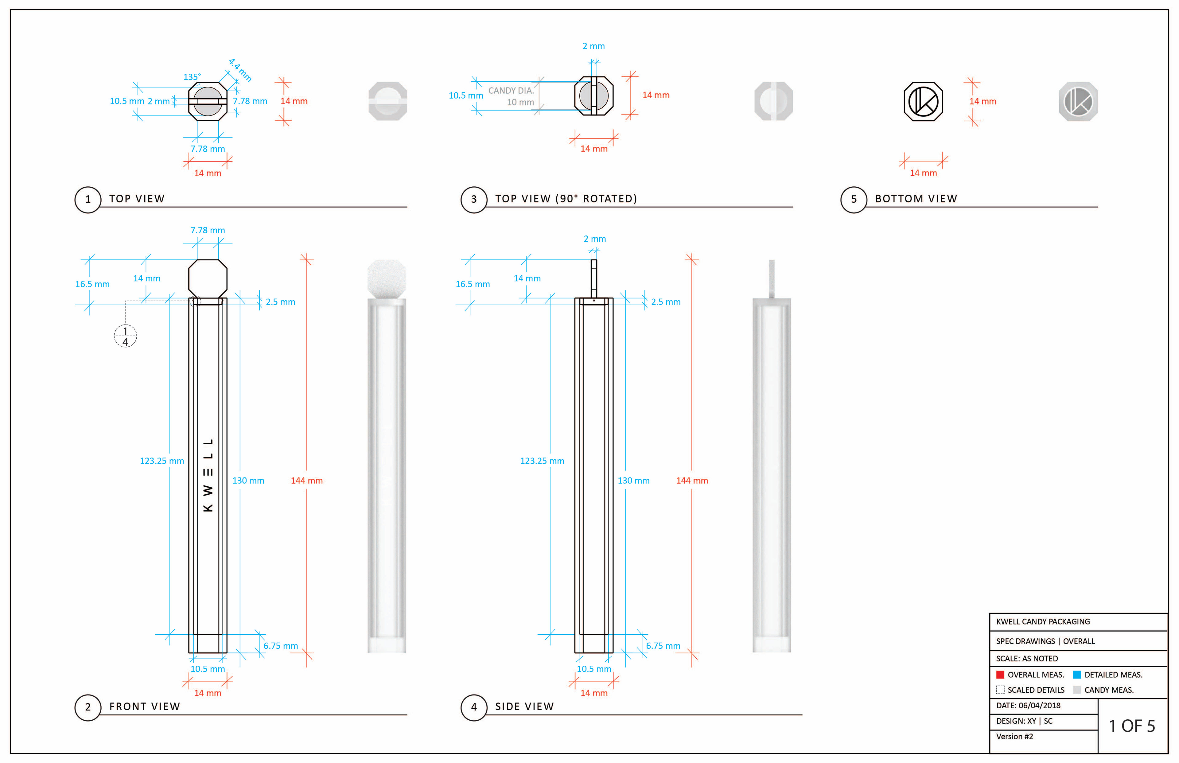
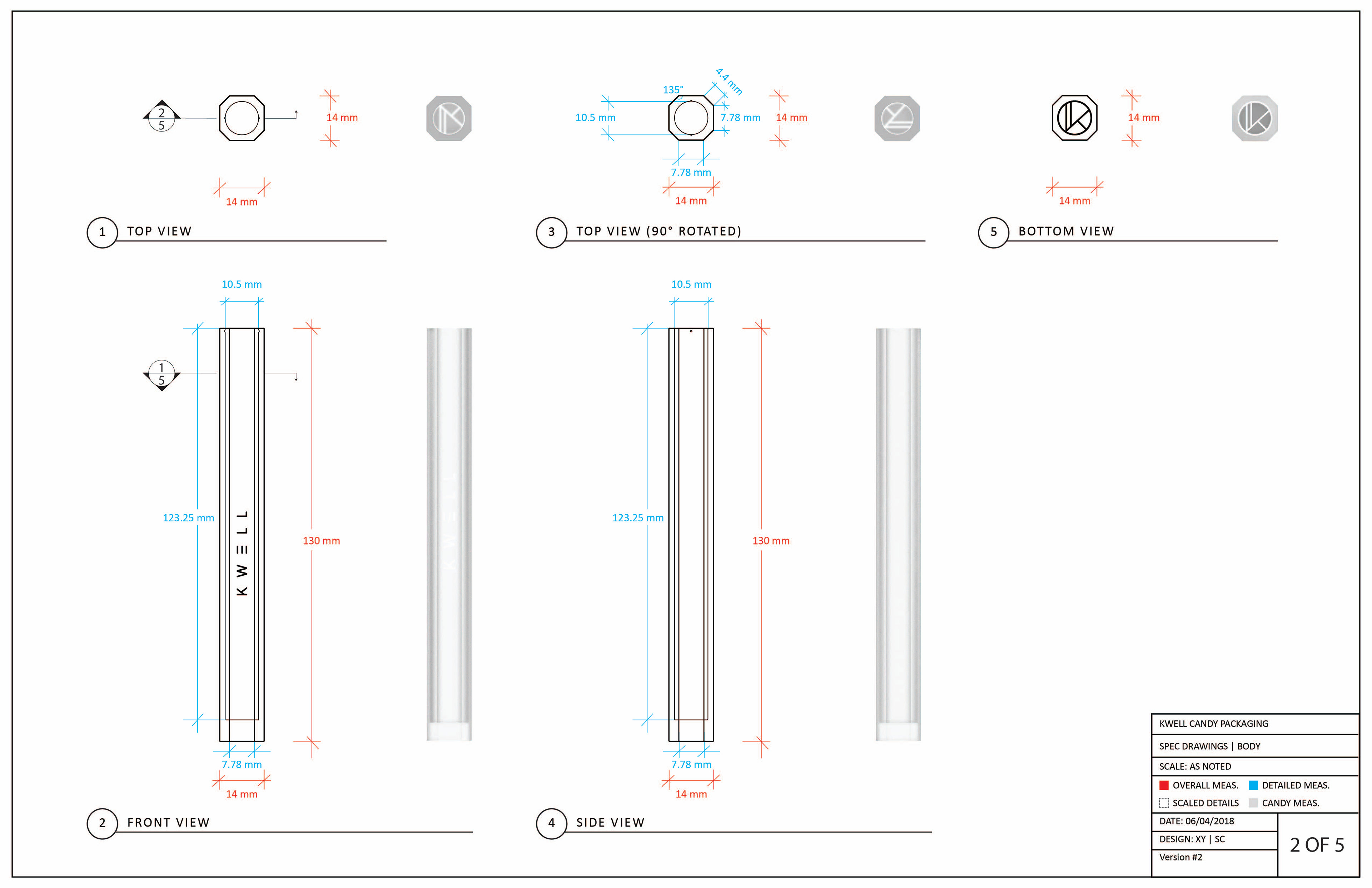
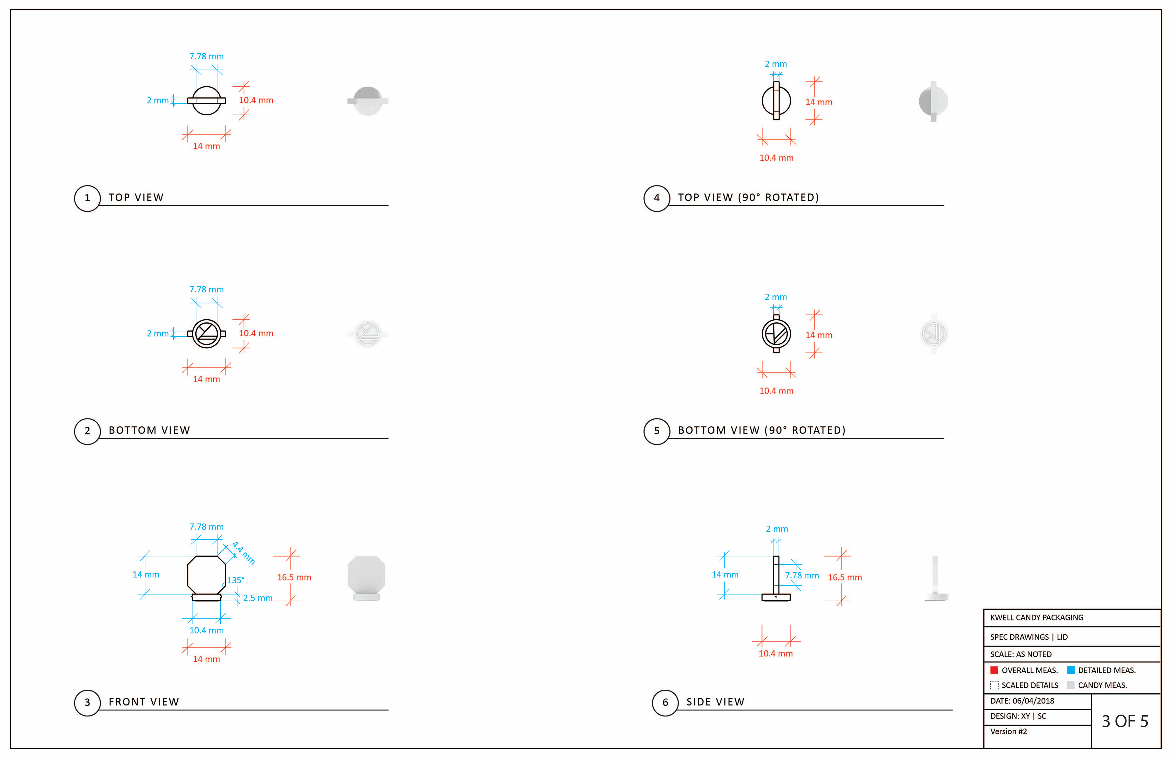
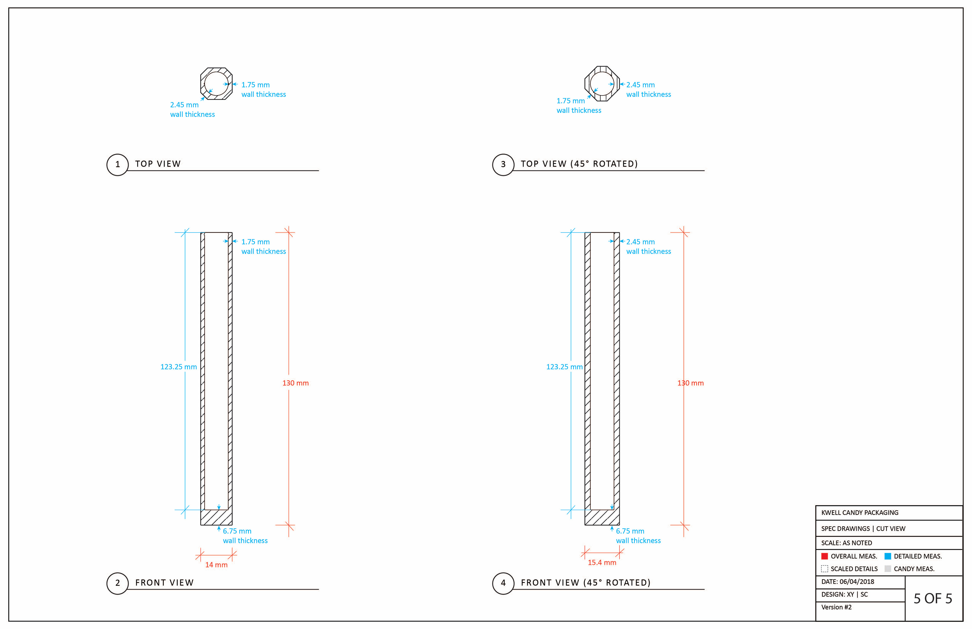
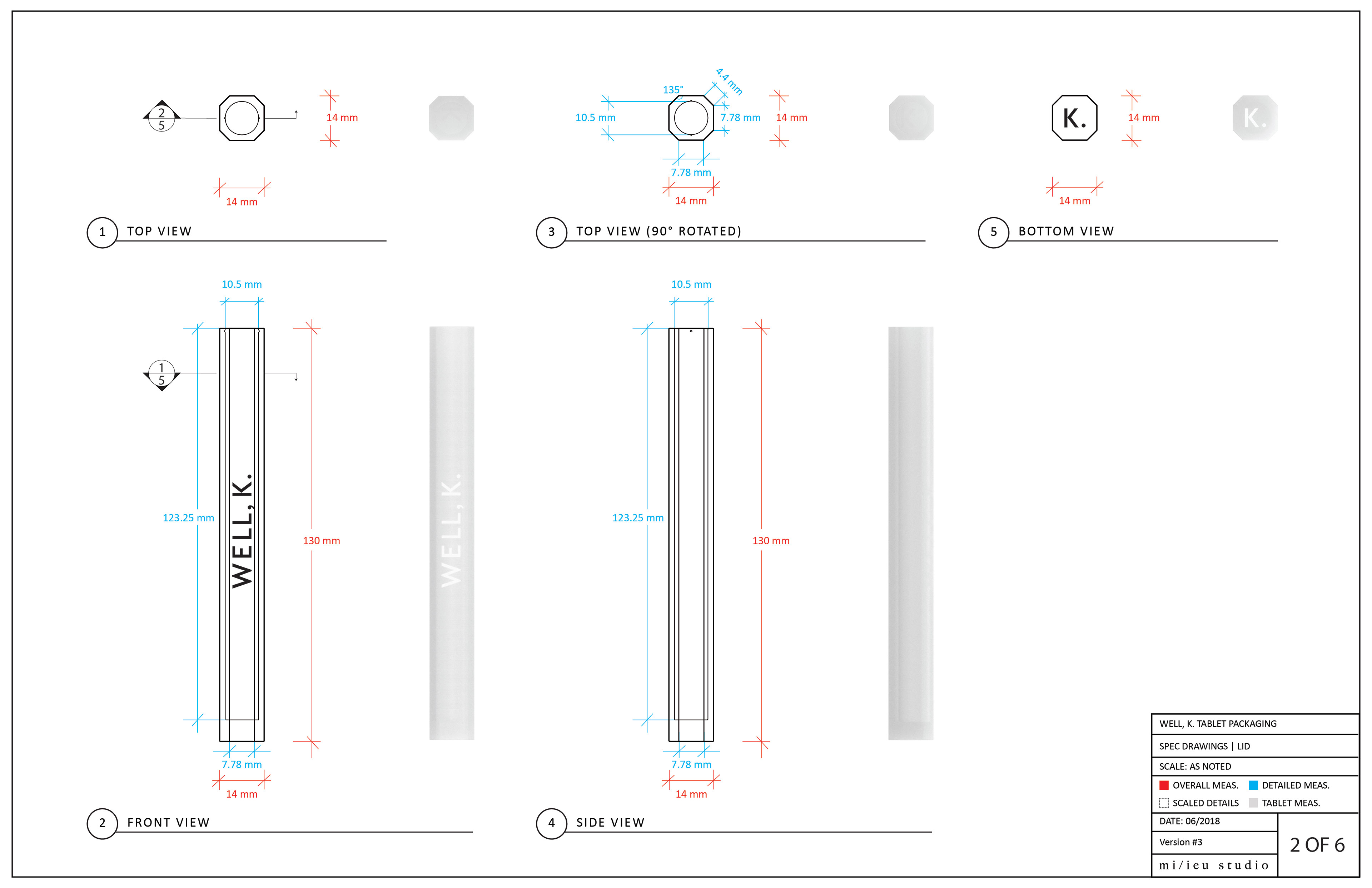
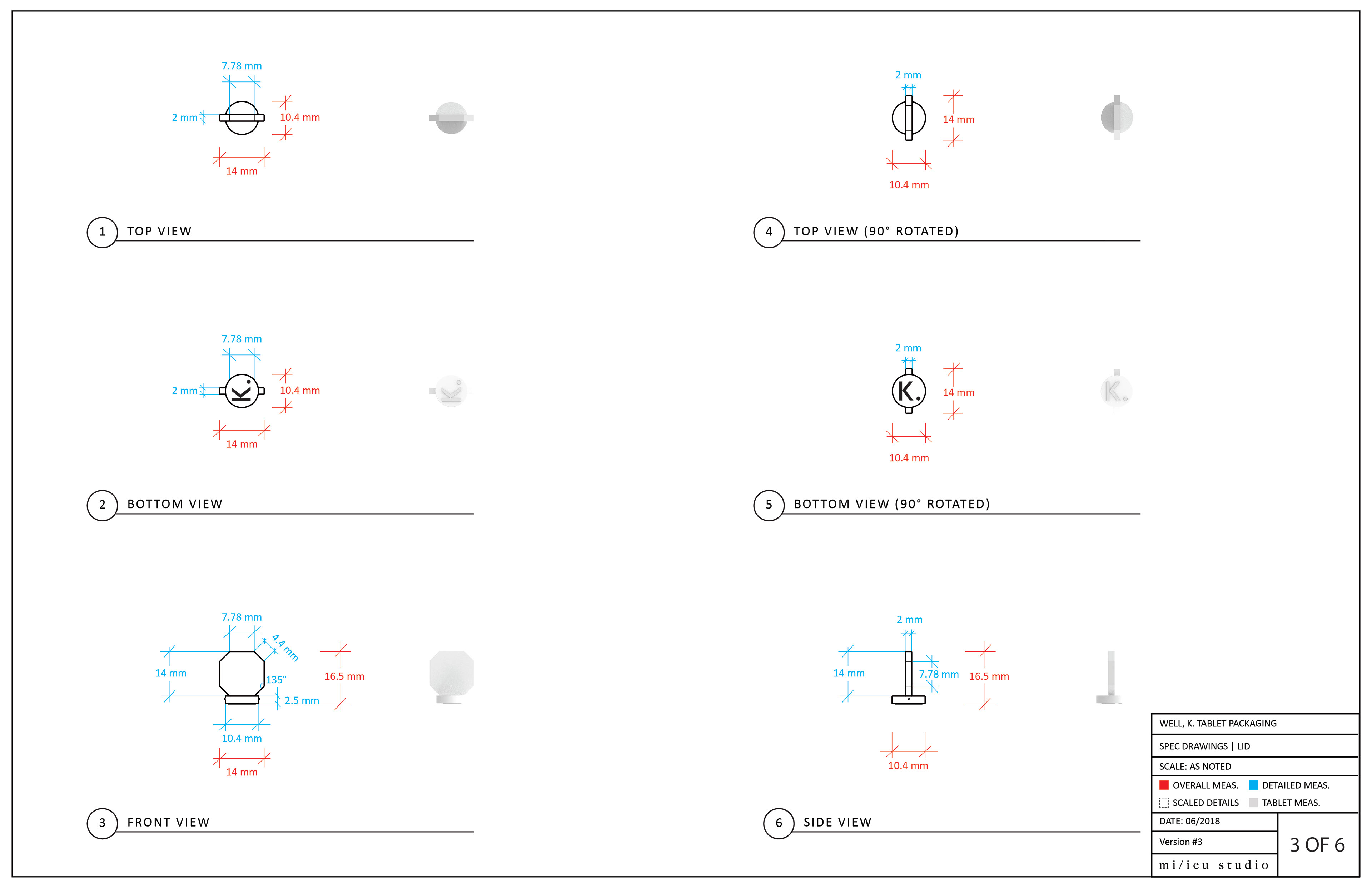
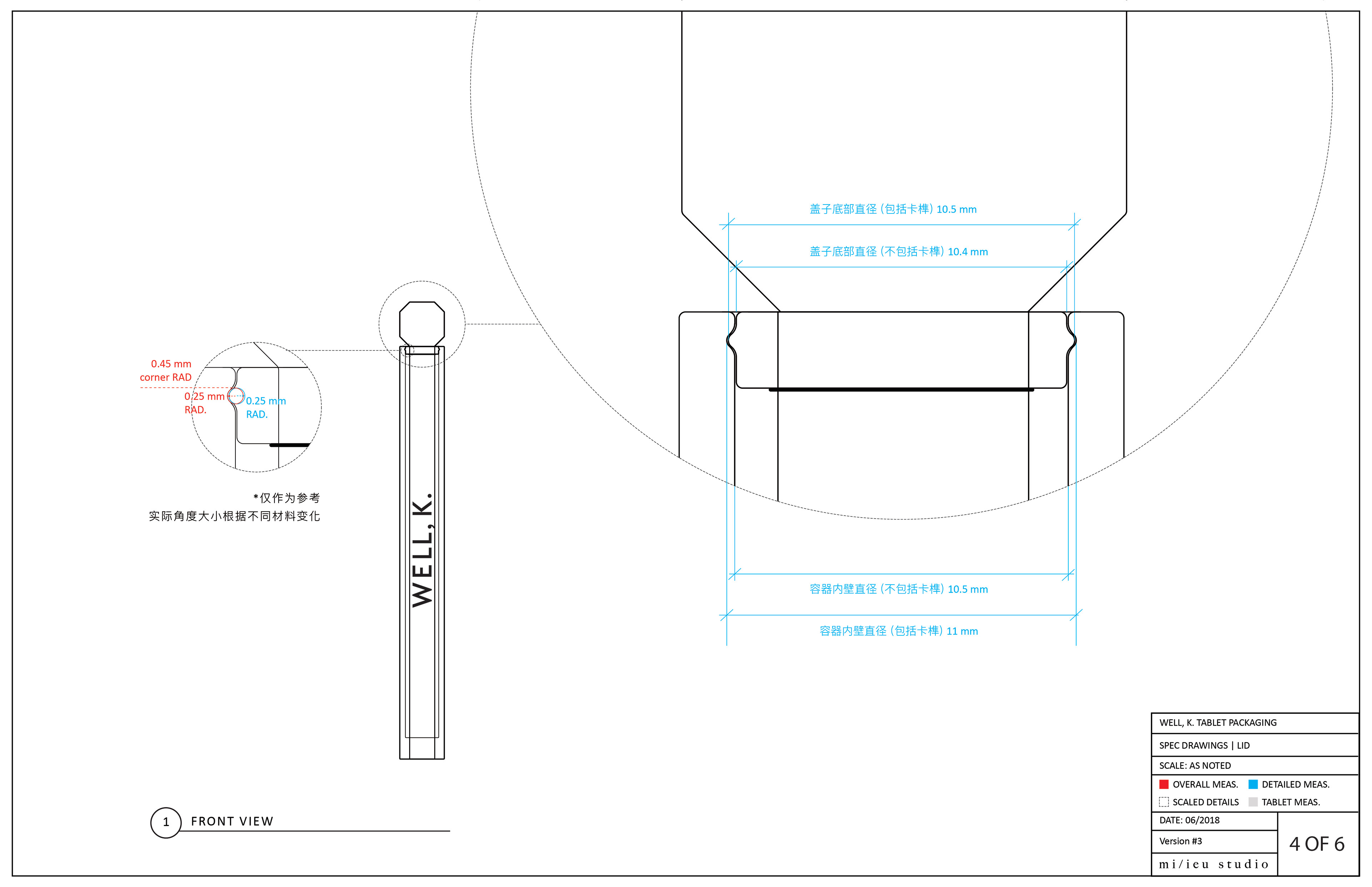
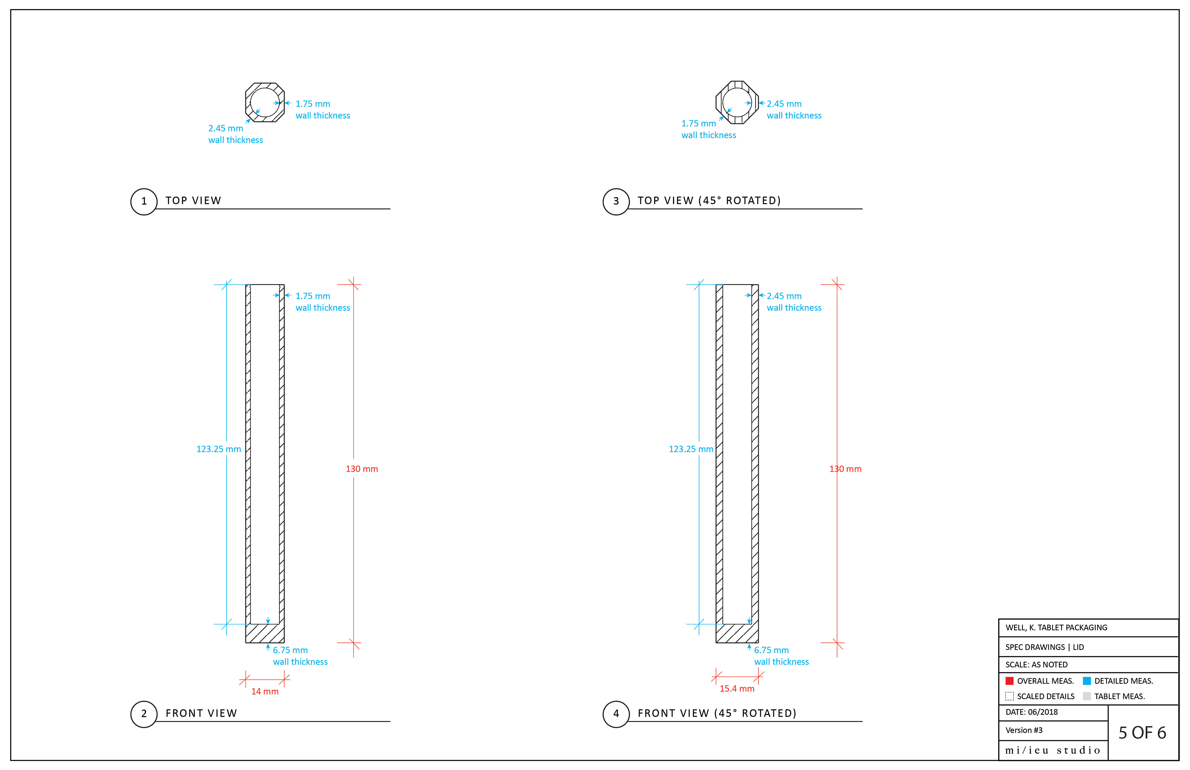
To distinguish our tablet packaging from a bulky cylindrical and text-heavy white plastic bottle that can be commonly found on the market, we created a slim octagon shape that can be slid into bags and pockets of any size and easily organized, as it self-stacks. The octagon shape also prevents it from rolling around on a tabletop. We want our product to be effective, but also photogenic and sharable.
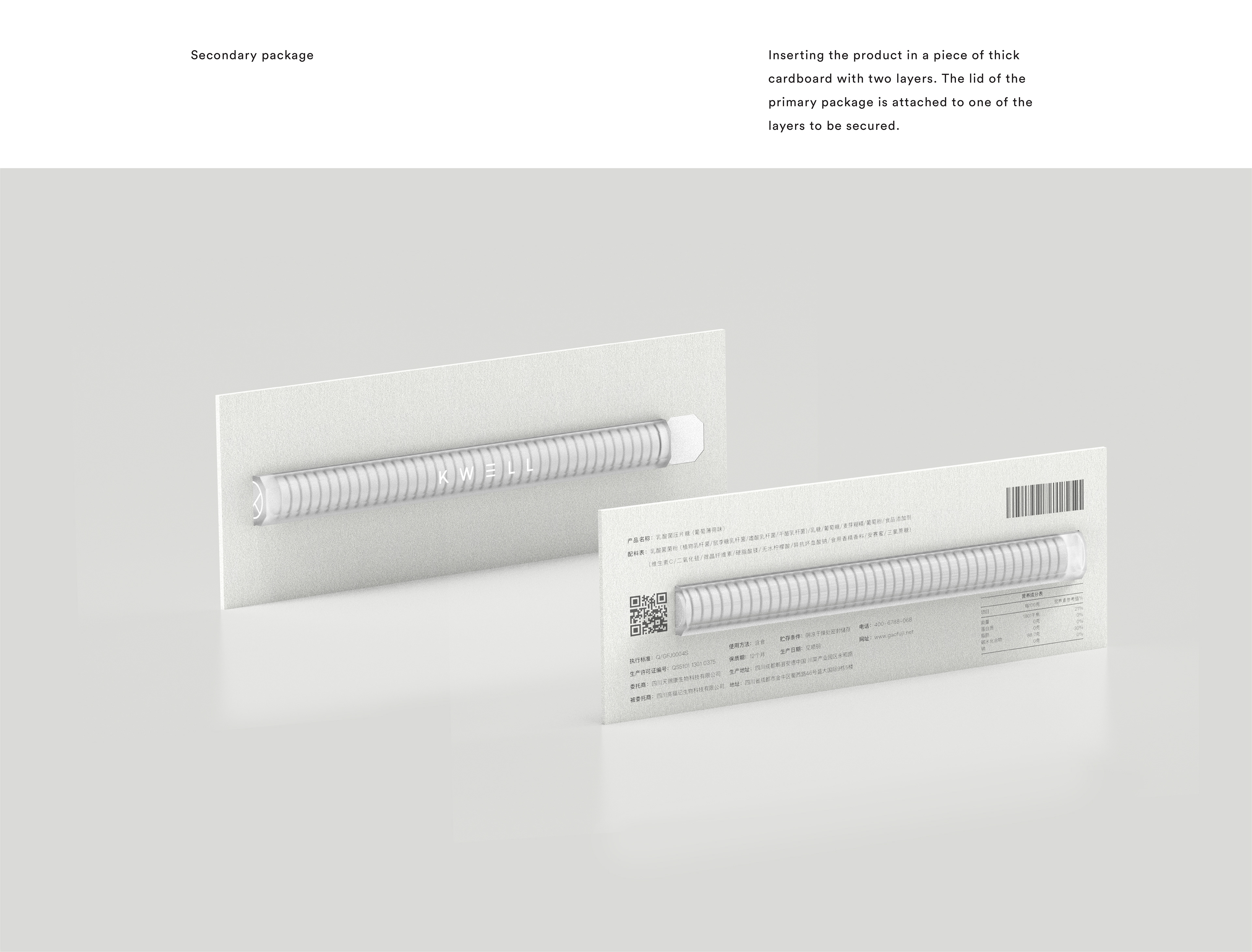
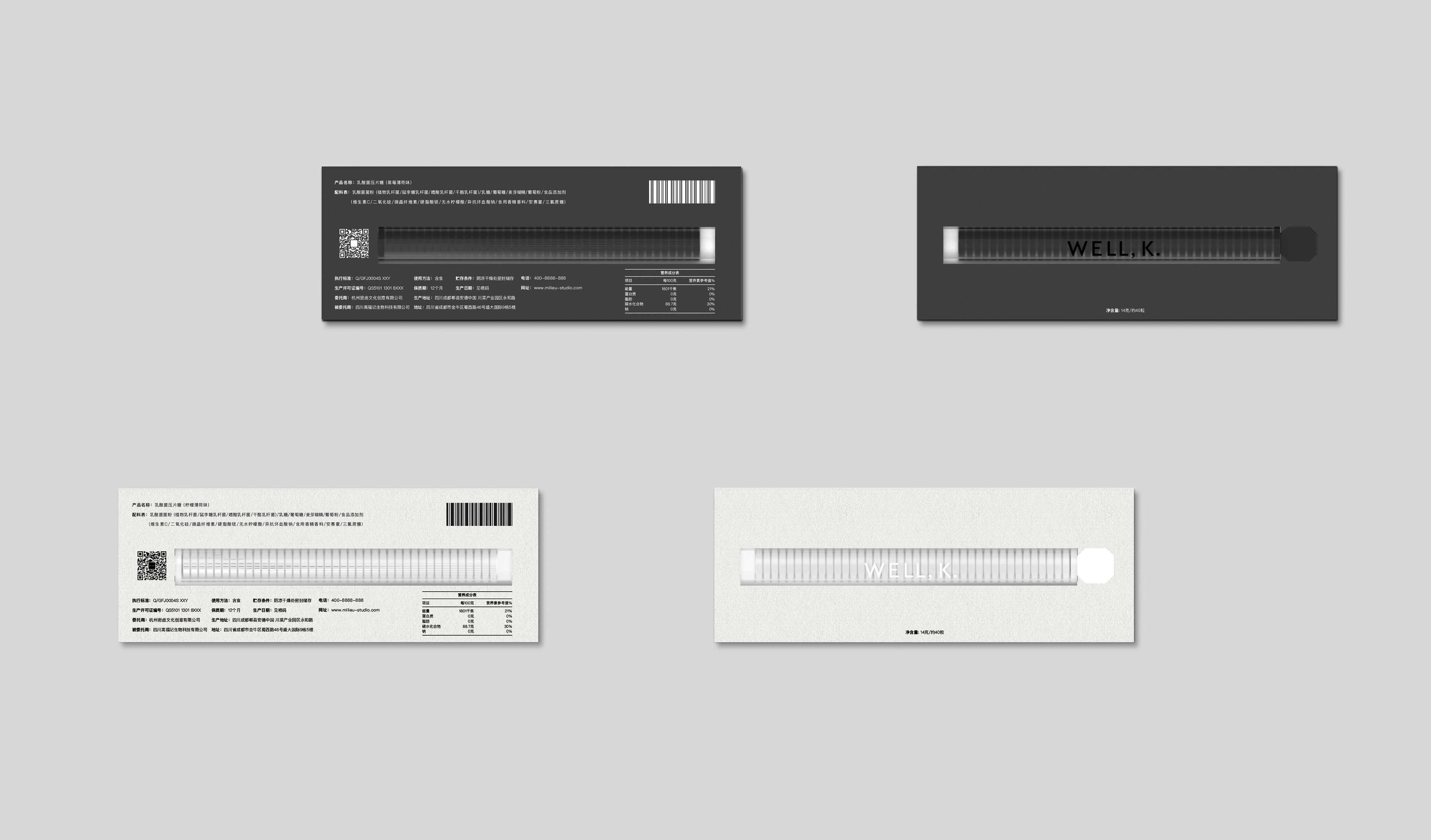
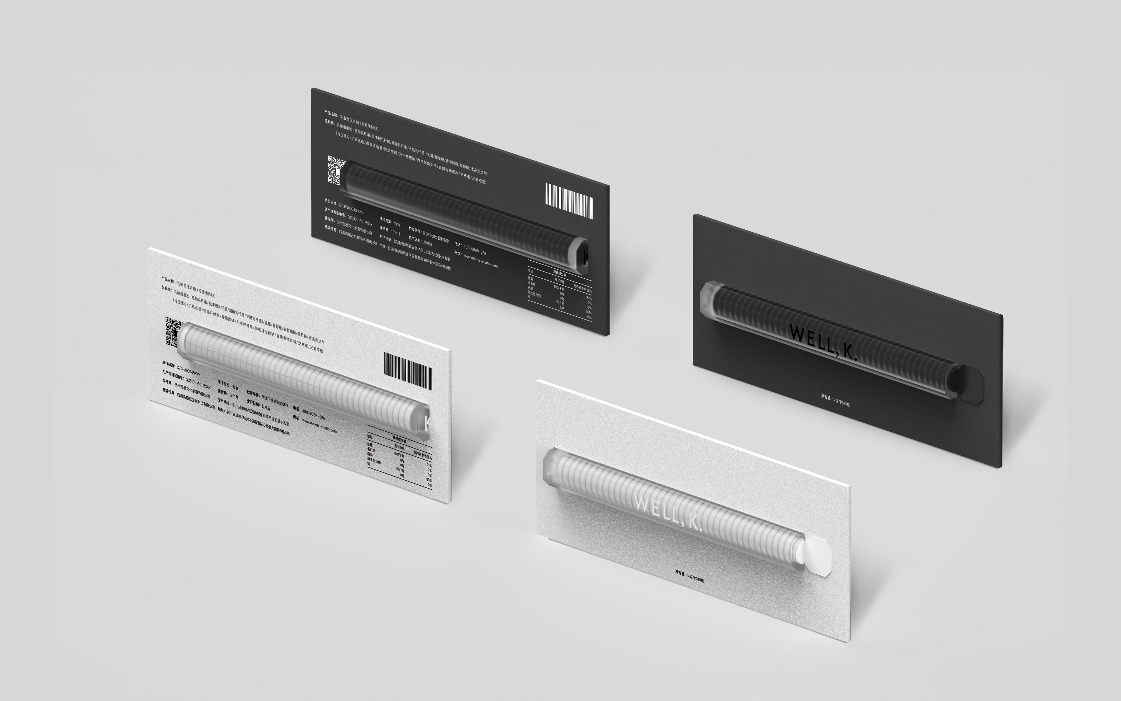
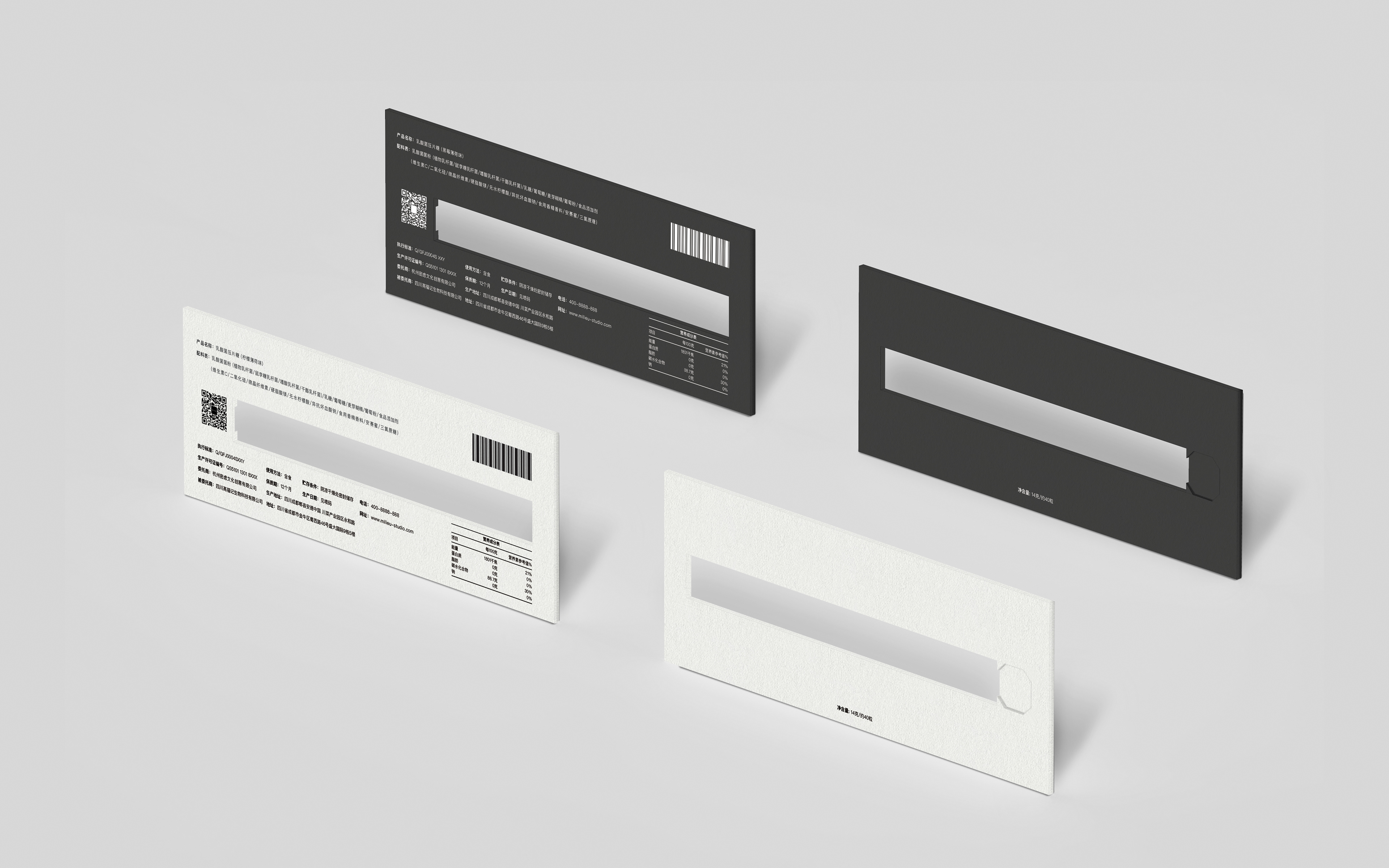
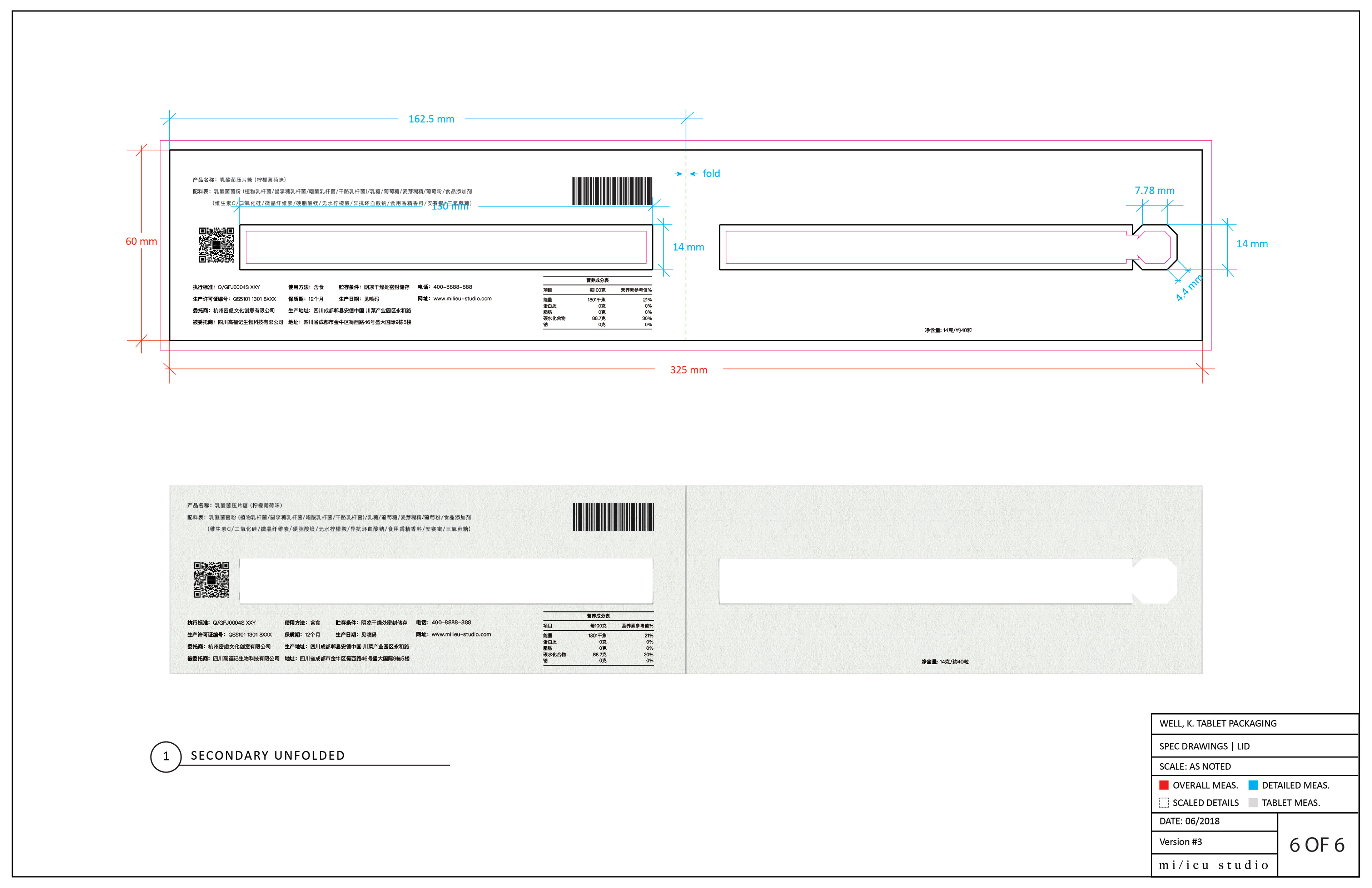
We kept the secondary packaging simple by using a single sheet of thick paper with one fold—just enough to hold the primary packaging and to list all the necessary information.

/////////////////////////////////// Updated on June 28, 2020 ////////////////////////////////////